
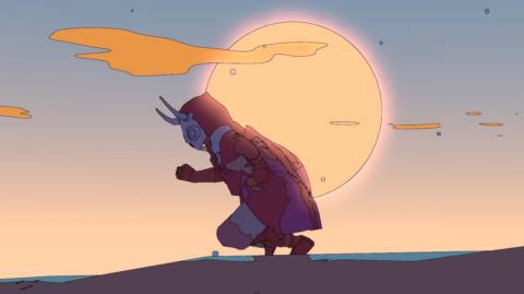
It’s funny how much the mind fills in. The art for Sable: you could say, hey, it’s Moebius, the French artist who once made the Silver Surfer such an elegant, lonesome presence, a needle of swift, glittering will darting above the blasted canyons of Manhattan. Or you could talk of the thinness of the line, the slow-strobing pastel colours, the sparing use of shadow.
But these are just separate pieces, and the mind fills everything in anyway. It works with the emptiness, giving this desert landscape with its speckled earth and Vegas carpet of exposed strata an overwhelming sense of spent time. Time passing! Centuries have soaked into the ground, bleaching animal bone and dulling machinery, revealing a hard, dry world scoured of obvious context. Wide expanses of sand make you wonder about what forgotten lake once pooled here. Meanwhile, the thin black line that gives the game its illustrative flair works on the scattered dwellings, rendering plasterwork with a powdery, ossuary feel, the ragged scraps of sheeting flapping like old shrouds.
The trees, what trees there are outside of the forest region, can seem seared, the outer bark stripped away by the sun. Elsewhere, the huge things lying about are ancient scrap, half-pipe fragments of something that was once vast and science-fictiony. Smoke rises against thin clouds – a clue? A prompt? And then night falls and the sky is suddenly so dark, so blue, the land loses its banding to the wonderful gloom, and the stars come out and make everything a delight.