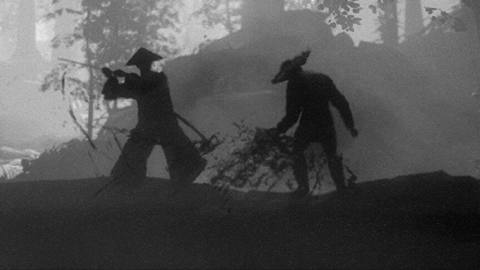
Trek To Yomi is a fascinating, extremely stylish release. Its aim is to emulate classic Japanese samurai movies, with Kurosawa and Kobayashi the clear influences. Everything from the letterboxed, monochromatic presentation right down to the film grain and shot framing are clearly inspired by Japanese cinema, with Unreal Engine 4’s post-processing pipeline used to render this stylised, cinematic experience. This isn’t a massive blockbuster title but there’s a deep fidelity to the source material here and a brilliant sense of aesthetics.
There’s an immediate sense that the developers have tried to really achieve something special here and that starts with the camera work: most of the game’s cinematics use a mix of stationary shots and slower panning shots, typical of early Japanese film. Camera framing takes a lot of inspiration from this work as well; a lot of care has been taken with shot composition, with carefully framed foreground, midfield, and background detail. The camera ends up being quite fundamental to the game itself, and it’s semi-fixed during gameplay – there’s no direct player control over this element, and most shots simply follow the player’s movement by scrolling or panning.
This enables the developers to use a strong and very high quality depth of field effect, even during gameplay. Shallow depth of field is present in virtually every shot here, emulating the long-lens look of Kurosawa films. In a typical game with a right-stick third-person camera, depth of field might obscure critical gameplay elements, but here the focal point of each scene is carefully defined such that this doesn’t occur. The relatively sedate camera movement avoids depth of field artefacting as well, which helps particularly on fine transparencies like grass and hair. A heavy film grain is also used here, embellished with scoring marks, bright lines and other artifacts, reminiscent of grain from old film stock.


