Welcome back, you beautiful bunch, to Box Art Brawl — our regular poll to find out which of two or more vintage video game cover variants from around the globe is the best, better than all the rest (diew, diew, diew-diew, diew), better than anyone we ever met.
Last time we watched F-Zero take itself to the races. It was a close call, but in the end it was the North American and European variant that took the chequered flag on race day, winning 57% of your vote and getting a faceful of champagne on the podium.
We’re sticking with the Super Famicom/Nintendo this week (it just turned 30, dontchyaknow) and looking at another classic launch game — perhaps the classic launch game. Super Mario World isn’t just one of the highlights of the 16-bit era, it’s one of the highlights of the medium, full stop.
Not much else to say really. Grab your cape and let’s get down to it.
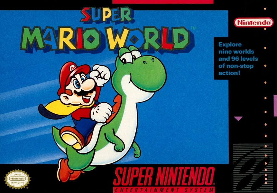
North America

The simplicity of this one is unusual and eye-catching. It’s Mazza and… err, Yozza shooting across an optimistic blue sky in classic 16-bit style. Mario’s yellow cape flaps in the breeze but there’s precious little else to distract from the fun of “nine worlds and 96 levels of non-stop action” ahead.
Mario is as vacuously happy and as enthusiastic as ever, but it’s Yoshi’s look at his plumber pal which really gets us. Mario might be the one notionally calling the shots on his dino mount (and socking his poor steed on the back of the head, apparently), but the dinosaur’s grin and endearing look show that he’s clearly humouring his little Italian compadre. “Yes, yes, okay Mario — get your cape and let’s go on an adventure…”
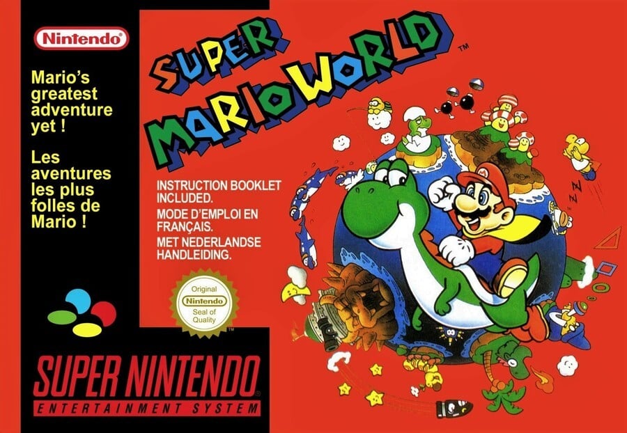
Europe

Much of Europe got a very similar cover to the North American variant, but several countries including France, Luxembourg and The Netherlands got this mash-up of the covers above and below. The same key art is flipped and sits on a background which shows the titular Super Mario world you explore and the enemies you encounter in the game.
There’s an awful lot of red, though. We like red. Red’s great! The other cover had loads of blue, so why not red here, eh?
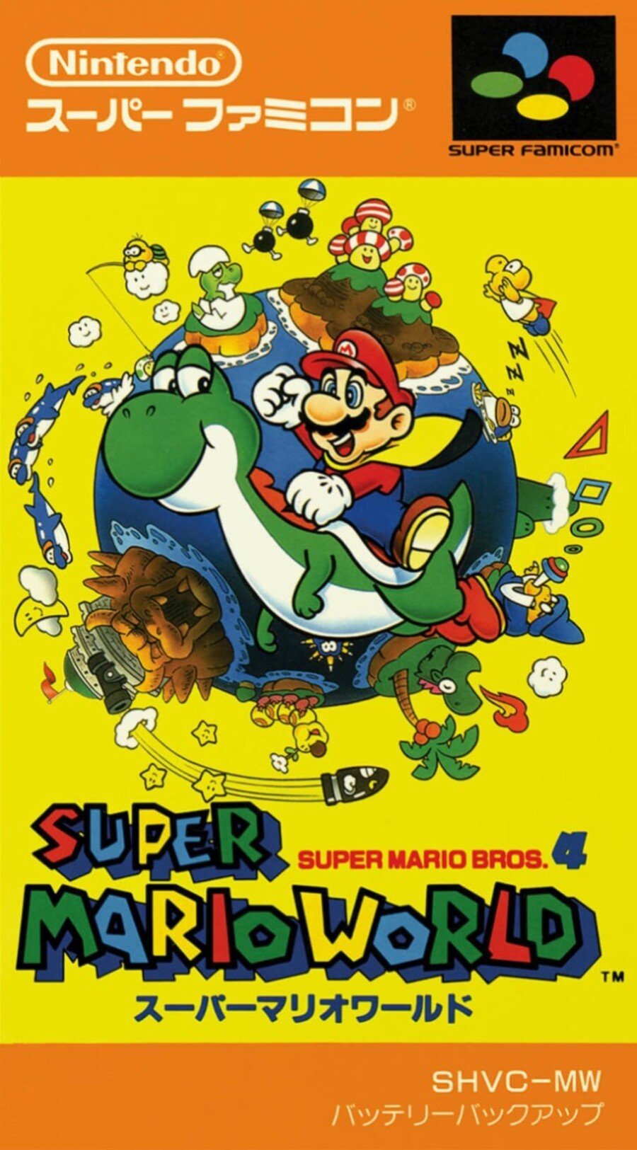
Japan

Super Mario Bros. 4, as the game is subtitled in Japan, features the same key art of Mario and Yoshi. The yellow background certainly pops—you’re not going to miss this when you glance at your shelf—and it’s framed top and bottom by a fetching pair of orange strips.
Definitely more going on in the Japanese version compared to the NA box, but does more equals better? That’s for you to decide!
So, you’ve seen the three options, but which is best? Pick your favourite and hit ‘Vote’ to let us know:
Have a wonderful week, one and all, and we’ll see you next time for another Box Art Brawl.
