Welcome back to Box Art Brawl, our weekly(ish) contest between box art variants from around the world.
Last time, to coincide with the 30th anniversary of both that game and its host system, we looked at SNES launch title Super Mario World. Thirty years! Time has its own Magic Cape, it seems. In the end it was the Japanese cover which brought home the bacon with over half of the overall vote. North America picked up nearly a third while poor old Europe (or the few countries that used the red variant as opposed to repurposing the NA cover) came in third place.
This week we’re looking at the most modern game yet to feature in the Brawl. These days games usually get the same cover internationally, but this one is an example which had a different version either side of the Atlantic for both its Wii U and Switch releases. It’s also a relatively unusual case where Japan and North America are the covers in sync, too, so they’ll be teaming up to take on Europe this week.
Yes, the release of Hyrule Warriors: Age of Calamity (which has some regional box art issues of its own) has got us thinking back to Breath of the Wild and all those Koroks we still haven’t found. Let’s return to Hyrule and see if we can’t find a few more, shall we?
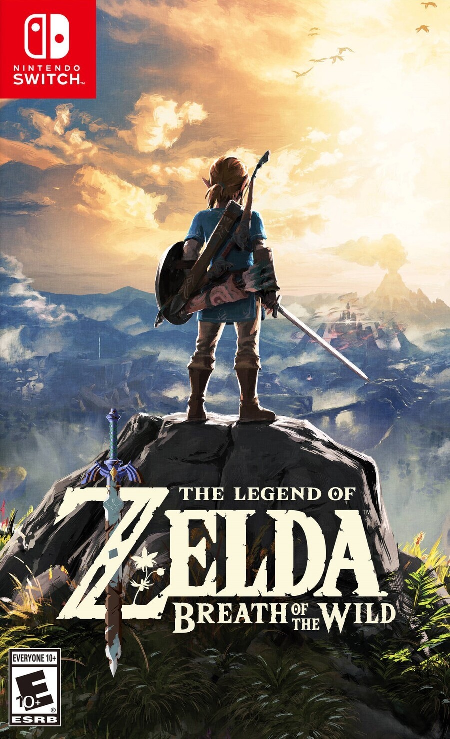
North America and Japan

As the sun begins descending in the western sky, the hero looks out across the kingdom, the danger of Hyrule Castle beckoning as Death Mountain spews into a cloud-filled afternoon sky; ominous, but also inviting. The foliage in the foreground highlights Hyrule’s wilderness and Link himself looks childlike in stature standing atop the huge boulder, framed against the massive world before him…
A great logo sits over an evocative image that captures and communicates the spirit of the game beautifully. We can’t get enough of this painterly style — it makes us go all verbose.
Top marks all round. It can’t get better than this, surely?
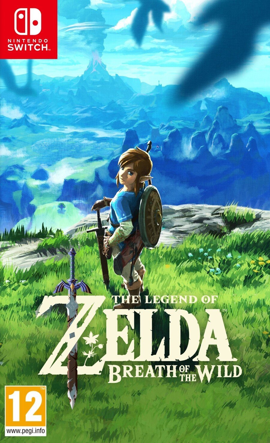
Europe

Oh, ‘ello cheeky. In the European version we’re looking down once again over Hyrule, and Death Mountain is still erupting in the background, but it’s much earlier in the day and the blue of the sky infuses the entire top half of the image. The bottom half is filled with the bright greens of of the long grass and flora, and Link himself turns around to look at us. What’s he saying? “Ready?” perhaps. Or maybe “Who the bloody hell are you and what are you doing in that tree?”.
It’s a different look and feel, but no less evocative. The placement of the birds here — out of focus in the foreground — gives this cover a less ‘epic’ feel and conveys more of the sense of being ‘in’ it. You’re part of this adventure already. Grab your things and let’s get back to it.
Add in the same great logo and we don’t envy the choice you’ve got to make this week.
So, you’ve seen two top-class, painterly covers this week, but which is best? Pick your favourite and hit ‘Vote’ to let us know below:
Have a brilliant start to December and we’ll see you next time for Box Art Brawl #70.
