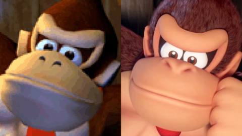
Mario vs Donkey Kong for Switch is a classic remake of the Game Boy Advance original, reimagining each stage in higher fidelity, turning interstitial stills into animated videos and even adding some additional content. Digital Foundry’s John Linneman and Tom Morgan had the chance to play through the game on both platforms recently, summarising the differences between the two versions and the quality of the remake overall.
The deliberate resemblance between the two versions is evident even from the start screen, with Mario and Donkey Kong staring at each other from opposite corners of the screen on both Game Boy Advance and Switch. From here, there’s a similar save data screen, then you’re straight into a cutscene – with essentially a series of stills for the GBA version that have been turned into fully realised and high-quality 16:9 video for Switch. This sequence ends and Donkey Kong squeezes into a keyhole on both versions, starting the first level proper.
Looking at that first screen, it’s clear that it’s a 1:1 remake with the same tiles, background and scale – but the wider screen of the Switch allows us to see further to the right of these relatively small puzzle stages. Even the interface is nearly identical, with lives in the upper left and time in the upper right – just the score has been removed from the top centre for a cleaner presentation.

