You might recall a couple of weeks ago that MultiVersus fans meticulously had picked apart a new gameplay video for its upcoming re-release, and came to two major conclusions: The game looked an awful lot slower, and the character models an awful lot bigger.
While the jury's still out on the first deduction, the second one has recently been confirmed by the developer itself. Player First Games took to Twitter to share a comparison between the old and new character sizes, as well as a little explanation behind the change.
“You all noticed right away, characters seem to be bigger,” the tweet read. “Numerous players had difficulty tracking characters both in play and while watching. We wanted to improve overall clarity of battle while keeping the same fundamentals.”
Taking a peep at the comparison pics, you really can see just how miniature the models were. Shaggy's head is nowhere near the bottom of the platform in the beta version of MultiVersus, whereas he looks far more in proportion with the stage in the full release. The one thing I am curious about is how it will affect larger characters like Iron Giant, who already took up a significant amount of screen space, especially on smaller stages.
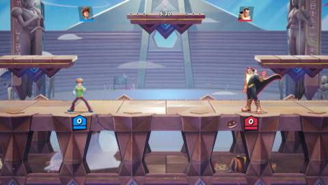
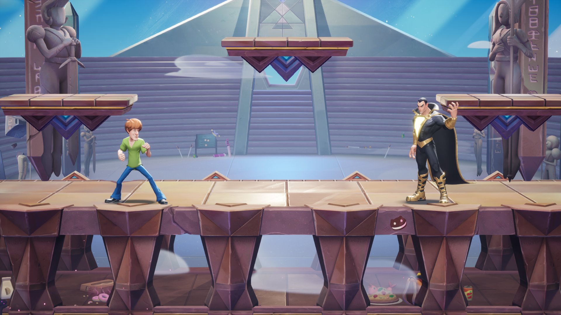
It's not just the models that have changed, though. “Our in-game camera is now more dynamic and will pan and zoom to provide improved readability, allow quicker reactions, and keep things snappy and fast,” the tweet continued. According to a more in-depth explanation in a blog post, it means that the camera will be closer in 1v1 combat, while zooming out to accommodate more folk when there are three or four players throwing hands all at once.
It's all in the name of improved readability, which is much appreciated, especially in a game where there can be an awful lot going on. It can make it hard to keep on top of where you're even located on the map, let alone what your opponents are getting up to. There's even a third change to try and make the whole thing easier to parse on a blow-by-blow basis.
“You'll now be able to see unique animations that showcase which state both your character and your opponent are in,” the blog post states. “Many of our updated animations not only help players read gameplay tactically, but also improve how visceral it feels.”
All of this, on top of “the game's new netcode,” should “improve both the clarity and accuracy of combat, leading to a much more consistent and reliable experience for you and your friends, even across the country.”
It'll be interesting to dive back in and see how these changes look and feel in practice. I'm not a huge platform fighter traditionally, but I did have a good time with MultiVersus while it was in open beta. Hopefully the year away has given the game a decent enough glowup and fixed some of its more frustrating issues.

