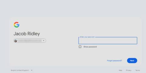
Google has been teasing a new look for its services for weeks and now it's finally here. It's a new Google sign-in page unlike anything you've ever seen. I mean, there are some changes. Okay, it's very, very slightly different.
The new entry portal to Google's services has the “Sign in” text moved to the left of the username login field to create a landscape format instead of having everything stacked in a single portrait-style column. This, ladies and germs, is the future.
There's even a Google blog post to help you get over the world-changing impact of this change. Here it details the how's and, importantly, the why. Basically because it now can adjust to the size of your screen. Y'know, for those new-fangled mobile phones.
“Why the page changed. The new sign-in page has a better layout for all screen types, which includes large and wide screens. The sign-in page adjusts to your screen’s size.”
For several weeks Google was running a banner with the following message:
“A new look is coming. Google is improving it sign-in page with a more modern look and feel.”
Needless to say, this less-than-radical overhaul has been attracting derision online. To quote one Twitter user:
“So, I had to look at that ugly banner for weeks and the end result is:
flex-direction: row
justify-content: space-between
💀”

Our Jacob is one of the few lucky ones to have gotten access to this new world of sign-in page design. One day, we'll all get it. Some marvelled at the number of man hours and meetings that no doubt went in to making this radical change possible, while others cast pithy, abrupt verdicts. “Looks worse.”
Change isn't for everyone, I guess.


