Blizzard has rolled out a surprise overhaul to Battle.net.
Battle.net, Blizzard’s PC app, often felt inadequate. It worked fine at first, but back then it was positioned as a glorified launcher for Blizzard’s games. With more and more Activision-published games now on it, it needed a lot of work to be on the level of Steam or any of the other PC apps.
It’s a good thing Blizzard agrees, then, because the developer has officially released a completely new version of Battle.net. In Blizzard’s words, this is Battle.net’s biggest ever makeover.
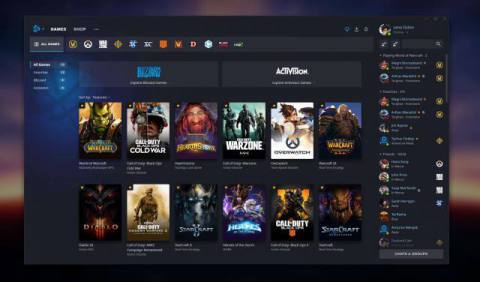
The new design, available only to some North American users at this time, moves the games to a top banner, and makes better use of the remaining space by making news and events for each respective game the focus, and integrating the friends list on the right.
You can now favourite games you like, and you’re still able to rearrange their order as you would with the old app. Notifications, too, have been touched up, with a new hub for all messages. Other notable upgrades include accessibility shortcuts that allow players to navigate the entire app with a keyboard, and expanded screen reader support.

This new look has been in closed beta for a while, but this is the first time most users will be seeing it. That said, Blizzard is slowly expanding it to more users in North America, and soon the rest of the world. You can, however, jump the queue a bit and opt into the Battle.net beta if you really want to download the new client today.
The post Battle.net gets total makeover in new update appeared first on VG247.


