
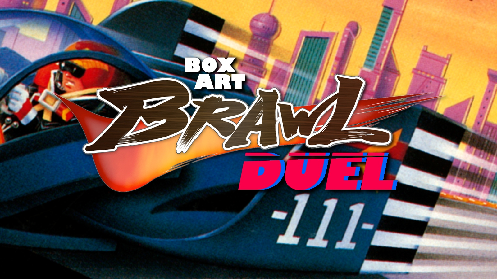
Welcome to Box Art Brawl, the weekly vote to find out which of two or more regional box art variants has what it takes to win your hearts and minds.
Last time we boarded the Halloween train with a trio of Resident Evil 0 covers. While Japan and North America scarpered to lock themselves in the WC when the ticket man came, the simple European cover proudly showed its 52% and was permitted to ride to victory. By the end of the journey, North America managed to just beat Japan to come in second.
This week we’ll be looking at a Super Famicom launch title (and we’ll be checking out a couple more throughout this anniversary month) — the mighty Mode 7 monster, F-Zero. While not necessarily our Favourite-Zero, it was an incredible debut for the series which helped showcase what the new 16-bit console could do. Nintendo Switch Online subscribers can catch up with it on Nintendo’s current console, too — it’s still a winner.
But which of our two racers this week will make it through the gauntlet of the Box Art Brawl? Start those engines…
Japan
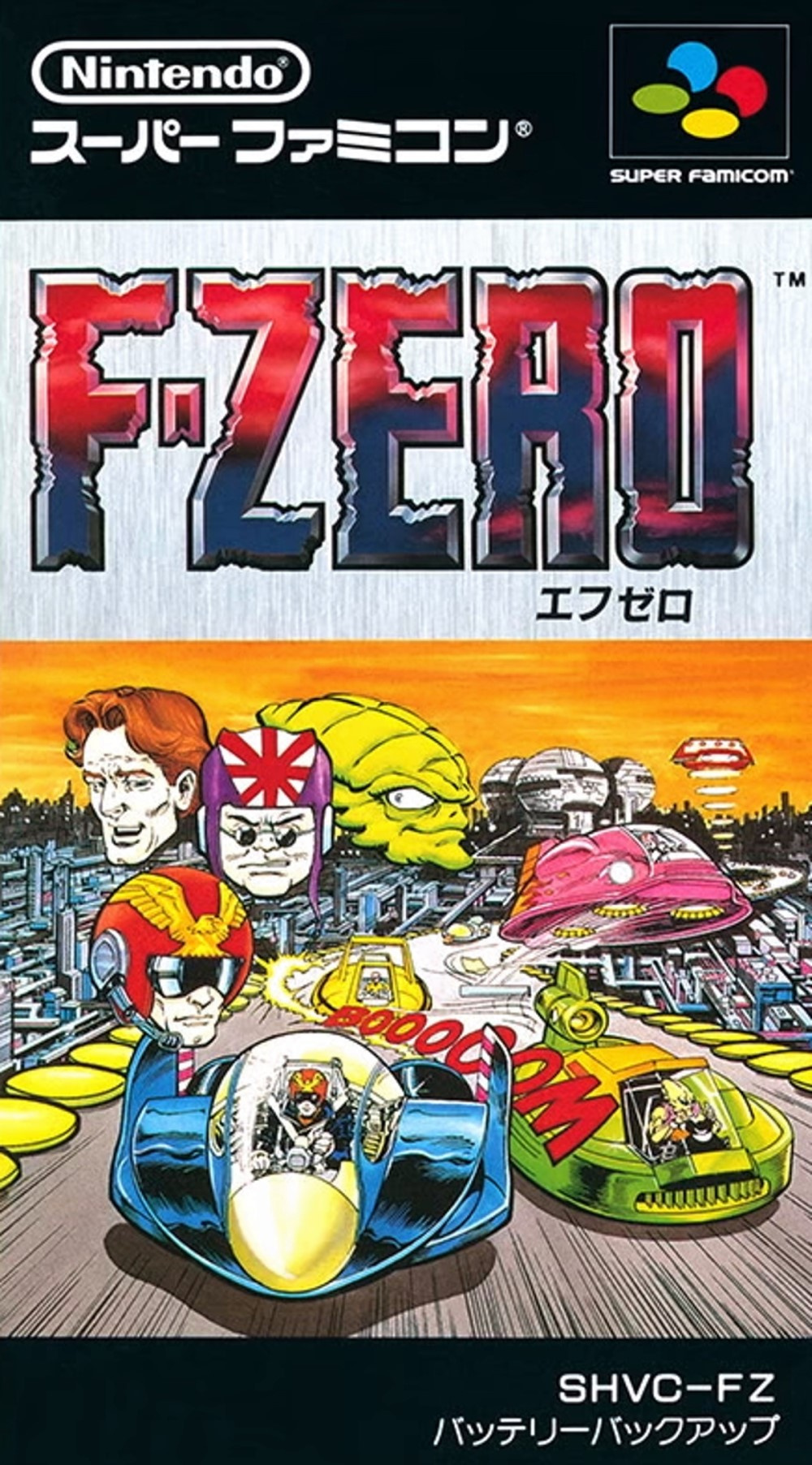
The SFC cover features a comic book-style key image with disembodied heads of several racers floating above the Blue Falcon in the bottom left. Comic book publisher Valiant were apparently enlisted by Nintendo to provide not only a comic book that came with the game, but also this front cover (thanks, Box Equals Art).
We’re big fans of the big red ‘BOOOOOM’ snaking between the craft and the overall feeling of speed and action captured here, and those hovering heads didn’t bother us until we started thinking about them. We like that they’re giving us a peek inside the cockpit at the expressions of the racers, but perhaps they’d work better with a concentrated grimace or some beads of sweat dripping down their foreheads.
The logo’s good, though — the embossed reddy-blue-purple standing out nicely against the brushed steel of the background, framed by a black strip top and bottom. We likey.
Europe & North America
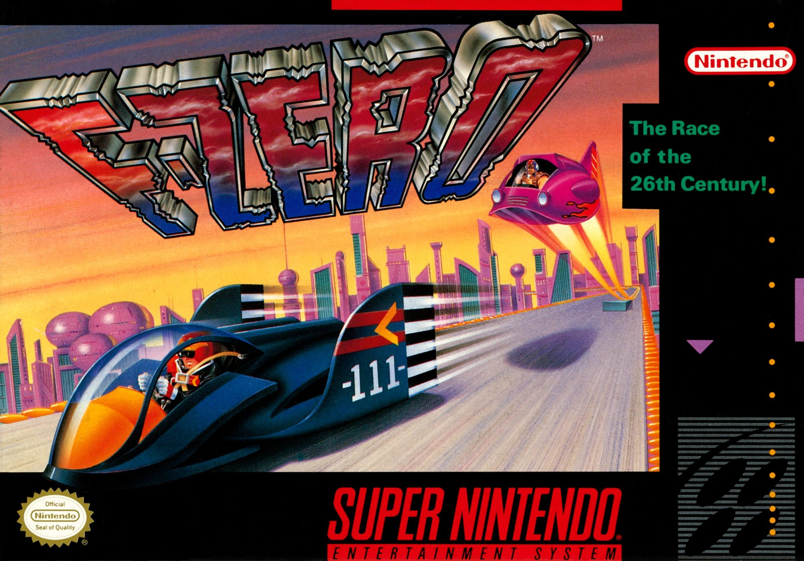
The North American and European cover (which went with a black or blue border depending on the country) used an entirely different piece of art. Samurai Goroh’s Fire Stingray is once again seen launching off a ramp, although this time he’s only got Captain Falcon up ahead to worry about. The same basic logo from the SFC cover is used, although here it has its perspective shifted to induce a sense of speed (or vertigo) over the pleasant skyline of Mute City during golden hour.
It’s very different from the Japanese cover, but we still like it. The rounded edges of the Blue Falcon — bearing its original ‘111’ designation — gives it a cute, chibi feel, and it’s good to see the Cap strapped in during the race. Not sure about the placement of the Fire Stingray’s shadow, mind.
So, you’ve seen the two options, but which is best? Pick your favourite and hit ‘Vote’ to let us know:
We hope you all have an exceptionally lovely week, and we hope to see you next time for another round of good-natured, civil scrapping over video game box art. Ciao!