
One of the many inexplicable shortcomings of Battlefield 2042 has to do with the game’s UI and HUD. Though DICE has brought back some missing features in recent patches, many of those elements are objectively worse in the new game compared to past titles.
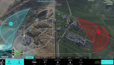
Case in point: the Battlefield 2042 deploy screen. This new iteration of this classic screen lacks clarity, requires too many clicks to make simple tweaks, and doesn’t feature some expected quality-of-life features.
For instance, the icon clutter makes it challenging to see where your squad mates are, and it doesn’t show you their first-person view so you can judge whether it’s safe to spawn on them. The loadout section at the bottom is too big, relying on a mobile-style tiled menu that isn’t capable of listing all options on a single screen.
